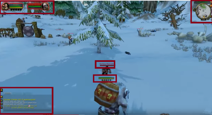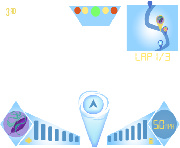
After completing the HUD I conclude that the video game HUD I created is pretty good.
It may be hard to understand which part of the HUD is which and which part I’m referring to at points part so for reference:
 This is the checkpoint I created.
 This is the health gauge I created along with the logo of the character the player is playing as.
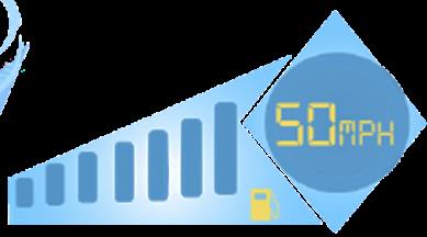 This is the fuel gauge (left) and the speedometer.
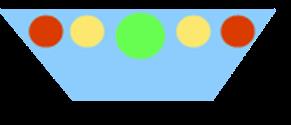 This is the start lights.
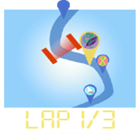 This is the map with the player’s exact place on the map as well as the checkpoint, below it is the lap placement.
 This is the players placing in the race.
 This is the way finder.
The general layout of the HUD at the bottom is kept even, creating symmetry between the two halves; this is more visually appealing than if I had the halves be different shapes or in different positions. However, this isn’t the same for the top of the page, where there is a larger amount of screen covered up on the right than the left, with the number placement being the only element on the left side compared to the map and lap number on the right, in hindsight it would have been better if I put the lap number underneath the number placement so there was some form of equality in how the HUD is divided.
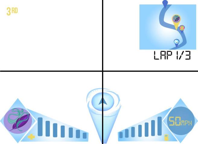
Above I’ve created a basic diagram using a slightly earlier version of the HUD that shows what I mean, the bottom row have almost identical amounts of space taken up by HUD as well as the HUD being kept mostly out of the way of the screen, meaning that it’s not an obstruction to the player. In comparison on the top row the map takes up almost its entire square while the number placement in the left box is very small and is kept in the corner.
Having such an unbalance creates asymmetry and while asymmetry can be an effective design method to draw attention to certain places or to simply create diverse designs, such a large difference can seem jarring to some, however this is more based on different opinions on what makes design good and appealing since many real games follow this design pattern of having a moderately big map in one corner while the other corner not being taken up by much. To add onto this, while I personally believe asymmetry detracts from the design, in some ways I can see it helping, I mentioned earlier how asymmetry can create diverse designs which is true, if I had had both the top and bottom parts of the HUD design be symmetrical it may have not been as interesting and could have seemed fairly plain and even boring depending on how I made the elements look, having asymmetry also helped attract the viewers’ attention to the top of the screen more naturally since it stuck out a lot more.
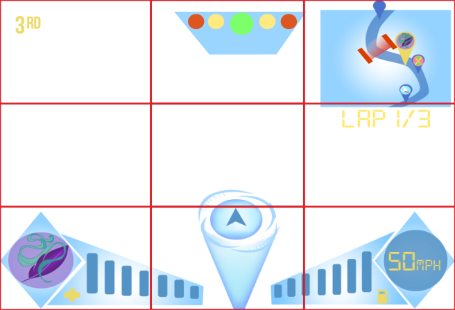
Applying the rule of thirds to my HUD design reveals that my way finder and start lights weren’t centred which, while wouldn’t have a disastrous effect, could be noticeable to some more observant viewers, centring the HUD more is something else I would do if I could go back and change something. The rule of thirds also shows that the health gauge, character logos, speedometer, fuel gauge and map all fit mostly into boxes, while most designs would encourage trying to put important elements of a design on the intersections of the rule of thirds, in a game it is important for the player to see the screen so it would be very hard to have all the HUD fit into the intersections so having the HUD be able to fit into the squares seems good for the type of design driving games have to follow since it’s still in places the human eye will naturally fall to.
I personally like the colour scheme I used for my HUD, it is fairly simple but I feel I was able to use it to my advantage, by using a basic three colour based scheme my design wasn’t overbearing and too saturated for the player to look at but the colours I used, which were light blue, dark blue and yellow, work well off of each other, with yellow and dark being able to contrast each other and light blue working as a good medium between the two. It was important to me that the colours held the connotation with the future and futuristic technology, I did this by using the colour blue which has been used numerous times through other media as a futuristic colour meaning that the connotation has already been put in place, making it easier to give my game HUD the image of a fturistic based game.
However, breaking away from the colour scheme, I used the colour red for the checkpoints, this was because I wished for it to standout againt the blue background and since the yellow had already been used fairly close by for the players map tracker it would have blended in with that rather than stand out and obviously be something important to be driven through. The other example of not following the colour scheme is the players logos, which are used in the left corner and to represent the players character on the map. It would have been fairly impossible to create a colour scheme for the HUD which would suit every logo because they use fairly different colours in their design, I personally believe that the logo standing out so much is a good thing as it can remind the player of which character they are playing as, it would have probably been a better idea to use the actual face of the driver rather than their logo as that would have given them a more personal connection to the chracters rather than just a logo however that would have caused a larger clash of colours between the characters colour schemes and the HUD colour scheme.
When I created the wayfinder I wanted it to look like a holographic projection, I think I achieved this goal fairly well, the reason for wanting to go with this design idea was because it would have added to the futuristic theme of the game as well as be a unique design choice, however it would have been better if I had reorganized the arrow slightly so it didn’t look like it had been squashed down while everything else stayed the same.

Another part of the wayfinder I like is the colour of the arrow, I got a lot of feedback on which colours looked best with the blue hologram, many said they liked the yellow and dark blue but a majority seemed to like the shade of blue I chose for the real way finder, many said it was because because, unlike the other colours it doesn’t stick out too much, while deisgning the way finder I wanted to use the final designs blue, so knowing that other people found it the best colour was a nice affirmation for it, however some people said they felt it should be a bit darker, to stand out more and while I wanted to use the final designs blue I saw where they were coming from with their feedback, if it had been a colour that contrasted more with the rest of the wayfinder the arrow would have stood out more, haivng more of a presence on the screen and, in turn, being more likely to be noticed, however if I had used a colour that contrasted more it could have had the side effect of having too much of a presence on the screen, detracting from the rest of the HUD, as well as possibly the gameplay given that wayfinders move around a lot as they direct the player on where to go. While I wanted the wayfinder to be noticable enough to be looked at by the player, I didn’t want it to become a distraction because of how it contrasted with the surrounding colours so I decided to follow peoples feedback on using a fairly desaturated dark blue.
An example of a HUD element I made that did need to stand out and use contrasting to its advantage was the speedometer numbers as well as the player placement and the lap number, these are fairly important pieces of information to display to the player and the player needs to keep an eye on this information becuase, in terms of the lap number and placement, it can help you win or lose by giving you information on where you are at that point in the race.
Talking about the player placement and lap number brings me onto the next thing I wish to evaulate, the font types, I personally liked the font type I used for the lap number, which was Digital 7 , it helped add to the impression of being technologically advanced, or at least have a focus on technology, an idea linked to the future a lot. However, I don’t like the font type used for the player placement, I feel it doesn’t suite the theme of futuristic technology that the rest of the HUD has, as well as being too small for the rest of the page, meaning it would be hard for the player to read it.
I personally think that the map and checkpoints came out a lot worse than I hoped, the map is fairly plain and doesn’t show much detail besides the map road, while that is good to keep from cluttering up the map and, as a result, confusing the player, it’s a bit plain and boring, especialy when compared to some of the other HUD erlements, like the way finder. The checkpoint I made red to stand out against the blue map, I had originally been planning on using yellow but it would have blended in with the players map tracker too much, usng red meant that the tracker would stand out much more becuase it’s the only example of red being on the HUD.
Sketchbook
I believe that I could have done a lot more with my sketchbook, the reason for this is because, while I had a page talking about colour schemes for the HUD and logos I never actually applied the HUD or logo colours to the designs I came up with, this was as a result of becoming focused on other parts of the sketchbook such as the actual design of the teams, their cars and the actual HUD designs.
This was a very disappointing and even slightly embarrasing mistake on my part which could have easily caused a lot more trouble down the road when it had come to creating the final logos and HUD, luckily the colour scheme page I had created was enough help to come up with a fairly good final colour scheme but if I had been colouring the logos and HUD designs, along with maybe some variations that show the other colour scheme ideas it would have been much easier.
While not colouring the designs were a bad mistake that, if I could go back and change my sketchbook I would remedy immediatly. I still quite liked what I did in my sketchbook, I liked the colour scheme page I had written as it gave me the chance to think more on specific colours I could use, I also believe that my actual HUD element designs were good and varied, helping me come to a conclusion on which I would use much easier than if I had only done one or two designs each. The work I did on the teams I also liked because of how much I put into it, I looked at a car design, logo designs as well as giving a design for the character the player would play as.
In summary of my work as a whole I felt that I was a lot stronger on the computer work than on my sketchbook, it was extremely disappointing that I left out the colouring of my designs which probably will hold me back from getting a great score for my sketchbook work. However, I still believe I put a lot of thought and work into my sketchbook even without the colouring. My computer work was a lot stronger because I was able to put more detail into it.

 This is the checkpoint I created.
 This is the health gauge I created along with the logo of the character the player is playing as.
 This is the fuel gauge (left) and the speedometer.
 This is the start lights.
 This is the map with the player’s exact place on the map as well as the checkpoint, below it is the lap placement.
 This is the players placing in the race.
 This is the way finder.


 PEGI 3 – The lowest age group and means that the game is suitable for all ages. A game with this rating may have violence in a comedic way, as seen in cartoons such as Tom and Jerry. A restriction on the game is that children shouldn’t be able to relate any characters seen on screen with real people and should be completely fantasy, as well as not having sound or imagery that could scare younger audiences such as jumpscares, gore and graphic nudity and sexual situations. PEGI 3 games must also not include any bad language, this ranges from curse words to words of discrimination or graphic violence.
 PEGI 7 – PEGI 7 follows the same rules as PEGI 3 except it can show more scary imagery or sounds that could scare children but not too extreme.
 PEGI 12 – A game given the PEGI 12 rating can have violence of a more graphic nature compared to PEGI 3 AND 7. The graphic violence can be directed at fantasy based characters and/or non graphic violence towards human-looking characters or recognisable animals, since it would be upestting for children to see more life like humans or animals hurt. Videogames that show slightly more graphic nudity would fall in this age category but it can’t become too extreme and must be kept tasteful and a minimum. PEGI 12 games can also have bad language must be mild and must still not be discriminatory or sexual in nature.
 PEGI 16 – A video game would recive this certificate when the violent or sexual nature became similar in apperance to what would be expected in real life. More extreme bad language including sexual language can now be used. As well as this PEGI 16 games can include the use of tobacco and drugs and the graphic depiction of criminal activities.
 PEGI 18 – PEGI 18 is the higest classification and means that the game is an adult only game. This certificate is given when the violence reaches a stage where it becomes a graphic depiction of gross violence and/or includes elements of specific types of violence. Gross violence is hard to define but the PEGI rating usually bases it on if the violence is so graphic that the viewer feels a strong sense of revulsion at the sight. PEGI 18’s can show much more graphic nudity and sexual situations as well as discrimination. PEGI 18’S can also be specific with drug and alchol use in game as well as use strong language.
 – Violence
 – Bad language
 – Fear
 – Drugs
 – Sexual
 – Discrimination
 – Gambling
 – Online gameplay with other people.
 A PEGI OK label indicates that game has been assed according to the PEGI rating system criteria and it has been found that there is nothing in the game that would lead to a higher rating than the standard 3+ category.
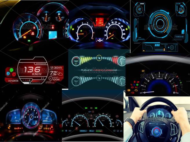 Seen above is the mood board I created which was based on car dashboards and HUDs. The word dashboard, in terms of a car means, a panel extending across the interior of a vehicle (as an automobile) below the windshield and usually containing instruments and controls; this of course includes the speedometer, fuel gauge and many other features that car racing games commonly use.