To create a successful poster there are some rules that have to be followed, these are:
Contrast, typography and composition
Contrast
Contrast is one of the most important parts of a poster as it’s what brings attention to the poster and helps the poster look good, however, when contrast is used too much it can result in being overbearing to the viewer.

Image from: http://www.impawards.com/2001/corky_romano.html
For example, this poster is a good example of the worst way to use contrast because, as a result of the saturation of the two main colours red and yellow, the poster is hard to look at. The over use of red against yellow is also a bad choice for contrast because the denotation for the colour combination red and yellow is fire, which is linked to danger and is off-putting and unwelcoming to the viewer.
Typography
The typography is also important to the poster as the style of the text denotes what impact the poster wishes to give off, by this I mean that, for example, using san-serif font would give the viewer the impression that the poster was much less formal compared to if it used serif font, using san serif can also create a sense of modernism and youthfulness which would be liked more by younger audiences while using serif fonts would create an air of formality and maturity which appeals more to older audiences. Also important to typography is the spacing of the words, if the words were too close together it is near impossible to read, however if it’s too spaced out the viewer may not realize the spaced out letters spell a word.

Image from: http://www.foxsearchlight.com/blackswan/
As seen above the posters typography uses serif font which is fairly close together but has enough room between the two words to appear as two words, this creates a formal and mature image for the poster and gives off the impression that the film the poster is advertising isn’t child friendly.
This film poster also works as a good example of contrast used correctly, black and white are complementary colours that a viewer can enjoy looking at, then there’s the contrast of the purple colour on the models lips, eyes and the small print above the heading against the black and white which stands out against both, drawing the attention of the viewer to it.
Composition
Composition is the layout of where the text, images and other elements of a poster are placed.
Composition also has a type of rules that it follows, these are:
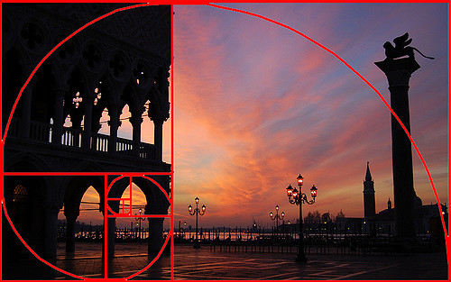
Rule of Thirds – Using rule of thirds is when the main object is put along a vertical or horizontal line or a point of intersection. The reason why doing this appears aesthetically pleasing is because when an object is put in the intersection or lines it looks more balanced and interesting, in theory. A foreground image increases depth and stance in landscape photos
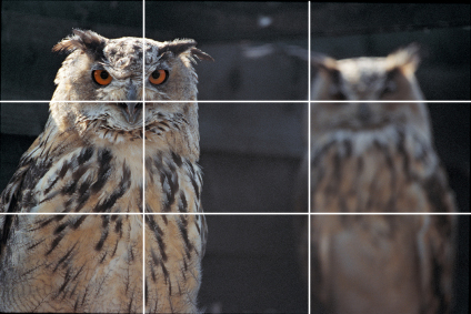
Image from: http://www.guidetofilmphotography.com/rule-of-thirds-example.html